






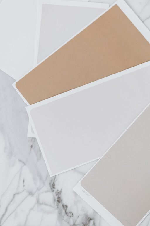
Creating a serene and restful environment in your home starts with choosing the right colors. Calm colors can transform any space, making it feel more inviting, peaceful, and comfortable. Whether you’re redesigning a single room or your entire house, thoughtful color selection is key to fostering a calm atmosphere.
In this post, we’ll explore practical tips for choosing calm colors, how different tones affect mood, and ideas to make your home a tranquil retreat.
Why Choose Calm Colors?
Colors have a strong impact on our emotions and well-being. Calm colors help reduce stress and promote relaxation, making them perfect for spaces where you unwind or spend a lot of time.
Neutral shades, soft pastels, and muted tones are often associated with calmness. These colors can make rooms feel larger, airier, and more harmonious. Using calm colors strategically in your home can improve sleep, focus, and overall comfort.
Understanding Calm Color Palettes
Soft Neutrals
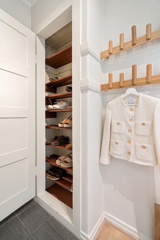
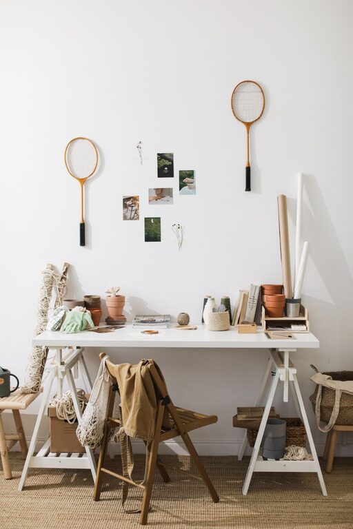
Neutrals like beige, ivory, soft gray, and off-white are timeless and versatile. They serve as an excellent base for calm interiors because they don’t overwhelm the senses and work well with almost any décor style.
Pastel Hues
Pastels such as soft blues, gentle greens, pale pinks, and lavender bring a subtle splash of color while maintaining a soothing vibe. These shades evoke feelings of nature, freshness, and serenity.
Muted Tones
Muted colors are less saturated and more subdued. Dusty blues, sage greens, and warm taupes are examples of muted shades that add depth without causing visual clutter or excitement.
Tips for Choosing Calm Colors for Your Home
1. Consider the Room’s Purpose
Think about how you use each room. Bedrooms benefit from relaxing colors like soft blues or light greens that promote restful sleep. Living rooms can embrace warm neutrals or muted pastels to encourage socializing without overstimulation.
2. Test Samples Before Committing
Paint colors look different under various lighting conditions. Always test samples on your walls and observe them at different times of the day to see how they change with natural and artificial light.
3. Use a Balanced Color Scheme
Calm colors work best when combined thoughtfully. Use the 60-30-10 rule: 60% dominant color, 30% secondary color, and 10% accent color. This balance creates harmony without overwhelming the senses.
4. Incorporate Natural Elements
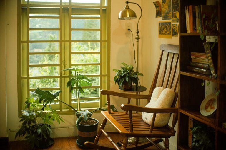
Colors inspired by nature—such as soft greens, sky blues, and earthy browns—naturally create calm spaces. Pair your color choices with natural materials like wood, stone, and plants to enhance the peaceful vibe.
5. Avoid Overly Bright or Dark Colors
Bright, intense colors like neon shades can be energizing but may disrupt calmness. Similarly, very dark colors can make spaces feel heavy or closed in. Choose lighter or medium shades to maintain tranquility.
6. Use Color Psychology as a Guide
– Blue: Promotes calm and focus, ideal for bedrooms and offices
– Green: Represents renewal and balance, great for living rooms and kitchens
– Lavender: Soothing and restful, perfect for bedrooms and bathrooms
– Beige and Gray: Neutral and grounding, suitable for any room
7. Consider Matte or Satin Finishes
Matte and satin paint finishes reflect less light and reduce glare, contributing to a softer ambiance. Glossy finishes tend to be more vibrant and may disrupt the calm mood.
Putting It All Together: Design Ideas
Calm Bedroom Color Ideas
– Light blue walls complemented with white bedding and natural wood accents create a peaceful retreat.
– A soft green accent wall combined with cream-colored furniture adds a touch of nature indoors.
Relaxing Living Room Palettes
– Use warm taupe or soft gray on walls with pastel cushions and throws for a cozy atmosphere.
– Pale lavender walls paired with beige upholstery provide subtle color while maintaining serenity.
Soothing Bathroom Colors
– Soft mint green or pale aqua walls evoke freshness and cleanliness.
– Off-white or light sand colors with natural stone accessories contribute to a spa-like feel.
Final Thoughts
Choosing calm colors for your home is a wonderful way to foster relaxation and comfort. By understanding the effects of different hues and using simple strategies, you can create spaces that feel peaceful and welcoming.
Keep in mind that calm colors do not mean boring. With the right balance and accents, your home can be both soothing and full of personality.
Take your time exploring shades, test them in your home’s light, and enjoy the process of making your home a calm sanctuary.